- About some months ago, we had published the basic guide to create blogger template which helped many of our readers to become blogger developer and it also went viral, but still its rolling there.
- It was basic guide, and we left many things than can make you pro blogger developer and today we're back with one of the most important things that every blogger template should have.
- We're gonna discuss that how can we make our blogger templates responsive. Don't know about responsiveness? Don't worry, we're here to tell you all.
- Either it is blogger template or any other web template, we can generally call it "Responsive Web Design".
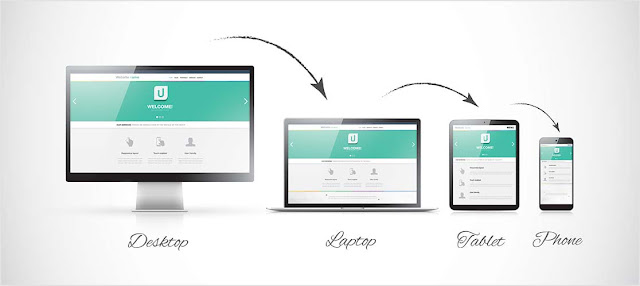
- Let me describe in simple and common words, Responsiveness is a feature of the web theme that allows the design to fit in any screen size.
- In the today's technology world, people use different devices like laptop, tablet, mobile to surf the internet which have different screen sizes and our web themes must be optimized for all screen sizes to fit automatically in any device so that users may not face any issue while surfing our blog or site.
- These days, almost everyone have updated their web themes to fit in every screen but some old websites and lazy designers like me don't have updated yet. Yeah! Blogger Yard is not yet responsive because we're busy right here but soon we'll introduce the totally new version of Blogger Yard which will also be responsive.
- There are several reasons for making our blog themes responsive, the first and simple, it improves the user interface, it can increase tablet and mobile users and we can also generate more money with it if we display responsive ads that can appear in every screen size.
- So, Its time to learn responsiveness and we'll take a lot of time of you because we're gonna make this guide as long as we can. Let's start it.
- As you know that responsive web design can be made by using CSS only and there is an special tag in CSS that we can use for responsiveness. You can use Media Queries (@media) and its just simple like drinking water if you know CSS very well.
- These media queries acts like If Else Statements in JavaScript and also Conditional Tags in Blogger. We make many media query tags for each and every device screen size and put CSS content in it. The CSS content that will be added in these media query tags will only work in the specified screen size.
- Its not end here friend! There is one more thing that we forget to mention. Before working with media queries, we should add a meta tag below head that helps the browser to detect the screen size and work properly with media queries.
- Go To Blogger >> Template >> Backup Your Template
- Click Edit HTML >> Search For <head>
- Paste The Following Code Below It.
<meta name="viewport" content="width=device-width, initial-scale=1, maximum-scale=1"/>
- Save!
- There is nothing much difficult with this viewport meta tag. You have to just add it below your <head> and it will start working.


0 Comments