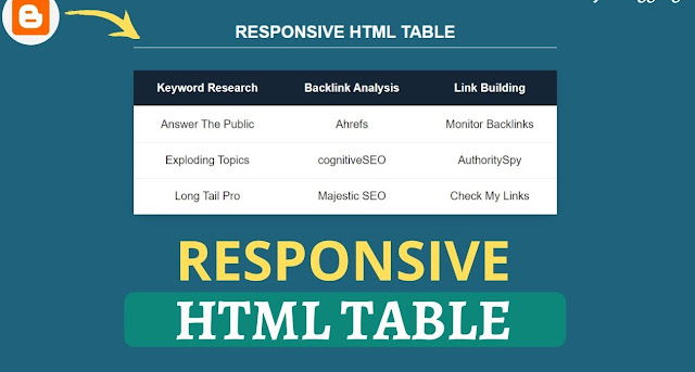
How to add responsive table to blogger: To add a responsive table to Blogger, you can use HTML and CSS to create a table and make it responsive. Here's a simple example:
- Log in to your Blogger account and go to your blog's dashboard.
- Click on the "New post" button to create a new post or edit an existing one.
- Click on the HTML tab to switch to the HTML editor.
- Paste the following code in the HTML editor:
<style>
table {
width: 100%;
border-collapse: collapse;
}
th, td {
text-align: left;
padding: 8px;
border-bottom: 1px solid #ddd;
}
th {
background-color: #ddd;
}
@media only screen and (max-width: 600px) {
th, td {
display: block;
}
th {
text-align: right;
}
}
</style>
<table>
<tr>
<th>Header 1</th>
<th>Header 2</th>
</tr>
<tr>
<td>Row 1, Column 1</td>
<td>Row 1, Column 2</td>
</tr>
<tr>
<td>Row 2, Column 1</td>
<td>Row 2, Column 2</td>
</tr>
</table>
- Save the changes and preview your post to see the responsive table.
- This is a basic example to get you started. You can modify the CSS and HTML code as per your requirements.


0 Comments